New visual identity
At the beginning of this year, in which we will celebrate 32 years of existence of our company, we are proudly presenting a new site and a new visual identity of Gradjevinar. During all these years of existence, we became a valuable and reliable partner of many domestic and foreign companies. We have created a huge network of business associates and suppliers, who have followed us and grown with us, in good but also in difficult times of sanctions, bombing, world crisis, and even now during the coronavirus pandemic. We have built thousands of square meters of production, business and residential spaces. At the same time, we have created our name and a recognizable brand, which today everyone recognizes as someone who respects all agreements, in terms of price, quality and deadlines.
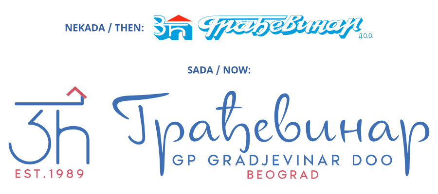
Respecting a long tradition, we did not want to erase everything that the first generation created. We wanted to express our gratitude, but also to make the evolution that we announced a few months ago. For those who didn’t know, the old, recognizable logo consisted of two parts: the number 3 and the Cyrillic letter Ć, under one roof, which represented the founder of the company and his two sons with the surname Ćirić and the large Cyrillic inscription GRADJEVINAR. Currently, the second and third generation of the Ćirić family (also a father and two sons) work in Građevinar, so number 3 and Ć are still there, under the same roof that symbolizes family values, but also our main activity – construction. Numerous former and current employees are also under this roof, who together with the management write important pages of our history, which we proudly point out by showing the year of foundation under the logo, as one of the few construction companies in Serbia with such a long tradition. We also stylized and adapted the textual part of the Gradjevinar inscription, keeping Cyrillic as the basic alphabet (respecting the long tradition of this alphabet and its significance in the identity of the Serbian people), but also adding the Latin name of the company just below, bearing in mind the growing number of our foreign partners, which don’t know the Cyrillic alphabet.
We are starting the year ahead with this big change, in the hope that 2021 will bring everyone much nicer and better things than the ones we had the opportunity to see during the previous year. We invite you to take a look at the new site and let us know your impressions of it and our new visual identity.